Auto-trade our signals with Global AutoTrading
Get notified of trend reversals for 100+ ETFs, 100+ stocks, and crypto
Protect and grow your capital in bull and bear markets.

MMT Performance Charts
Yearly Chart Comparisons
Understanding Simple Returns Charts
These charts display the sum of individual trade percentages for each year without compounding effects. Simple returns provide a clearer view of MMT's strategy quality by showing how our trading signals performed in isolation during each period.
By removing the compounding effect (where previous years' gains affect later years), you can make fairer comparisons between different time periods on equal footing. This view is especially valuable for evaluating MMT's strategy consistency across different market conditions and identifying specific years where our signals excelled or underperformed.
When compared alongside the Buy & Hold simple returns, you can directly assess whether MMT's trading signals added value within each calendar year, regardless of account size or previous performance. While compounded returns better represent actual capital growth, simple returns help you understand the raw effectiveness of our trading signals.
SPDR S&P 500 Trust ETF
NYSE: SPY
SPDR DJ Industrial Average ETF
NYSE: DIA
PowerShares QQQ Trust ETF
NASDAQ: QQQ
Yearly Chart Table


The main fact to observe from the table is that we have historically outperformed the buy-and-hold strategy of the market. Please compare the results for yourself.
Compounding Chart Comparisons
Understanding Compounded Returns Charts
These charts display MMT's strategy performance with profits and losses reinvested over time, showing how our trading approach would have compounded over time under the stated assumptions. Compounding provides a more realistic view of actual account growth as it factors in how earlier gains or losses affect the capital available for subsequent trades.
By comparing MMT's compounded returns to the Buy & Hold benchmark, you can see whether our trading decisions created stronger long-term results compared to passive investing. While simple returns help evaluate signal quality in isolation, compounded returns show how those signals would have affected historical capital growth when reinvested.
SPY Compounding Chart


SPY Investment Compounding Chart


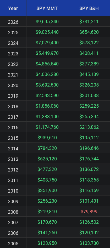
The compounding chart above visually compares the growth of a $100K account balance over time by reinvesting all profits in each trade (MMT Results) versus a buy and hold approach (B&H Results) since 2005. These results do not account for fees and slippage. You can also view each individual trade and how it affects the compounded balance [PDF].
SPY Investment Table Comparison

DIA Compounding Chart


DIA Investment Compounding Chart


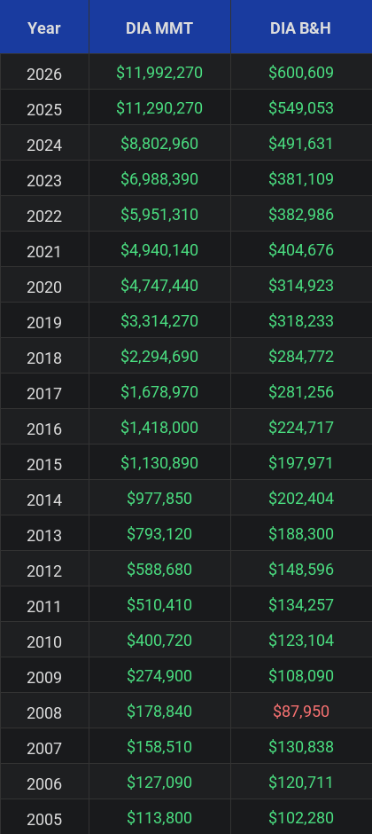
The compounding chart above visually compares the growth of a $100K account balance over time by reinvesting all profits in each trade (MMT Results) versus a buy and hold approach (B&H Results) since 2005. These results do not account for fees and slippage. You can also view each individual trade and how it affects the compounded balance [PDF].
DIA Investment Table Comparison

QQQ Compounding Chart


QQQ Investment Compounding Chart


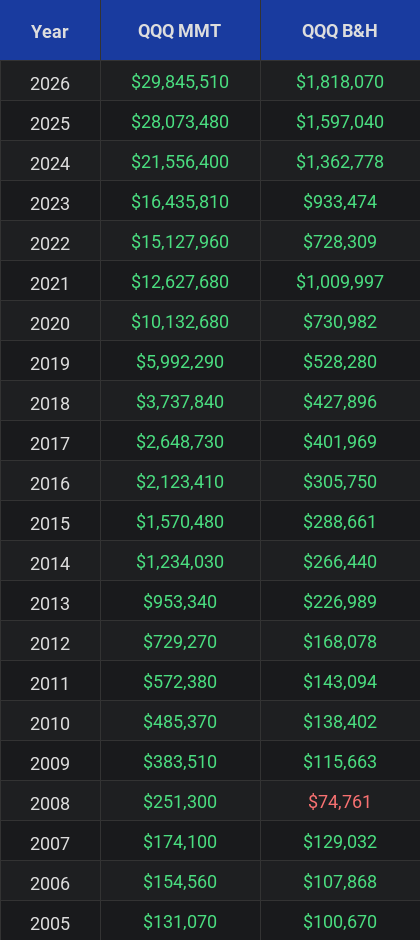
The compounding chart above visually compares the growth of a $100K account balance over time by reinvesting all profits in each trade (MMT Results) versus a buy and hold approach (B&H Results) since 2005. These results do not account for fees and slippage. You can also view each individual trade and how it affects the compounded balance [PDF].
QQQ Investment Table Comparison

"Timing is everything." - Ray Dalio
